Affordable Shopfitting Ideas For Your Small Retail Space
Small shop? Small budget? Time to think outside the square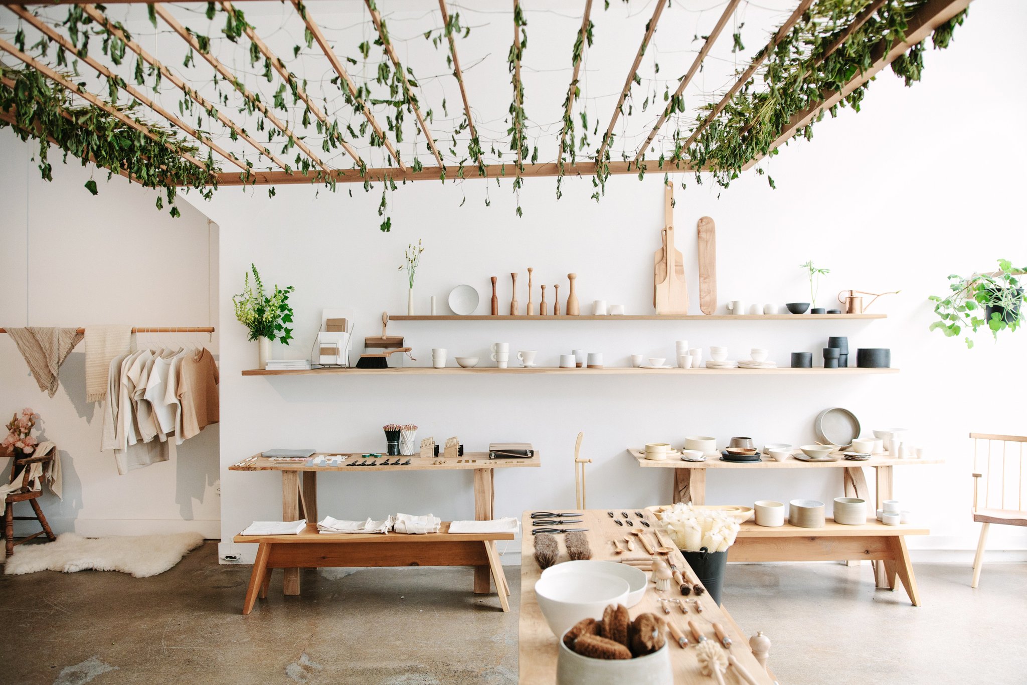
HOLD general store in Vancouver Island (image source: HOLD)
In spite of the digital age, a physical store still has an edge over its online presence in the sense that it captures the undivided attention of the customer. Retailers, regardless of their fitout scale or budget, have the opportunity to create and tell a story within their shop space, and so every detail should have an aesthetic purpose.
But fitting out your shop doesn’t have to cost you a fortune. In fact, smaller budgets and even smaller spaces are often blessings in disguise, allowing the imagination to run wild with simple ideas fit for maximum impact. A smaller space does, however, impel a certain amount of creativity and resourcefulness in order to achieve customer flow.
Most importantly, your small retail space should reflect your brand’s authenticity and thoughtful engagement throughout the entire process, including the planning, design and execution stages. Here’s an effective guide to fitting out a spatially limited retail space on a budget.
Create the illusion of space
Your strategic use of colour and mirrors will offer your customers an infinite amount of deceptive space.
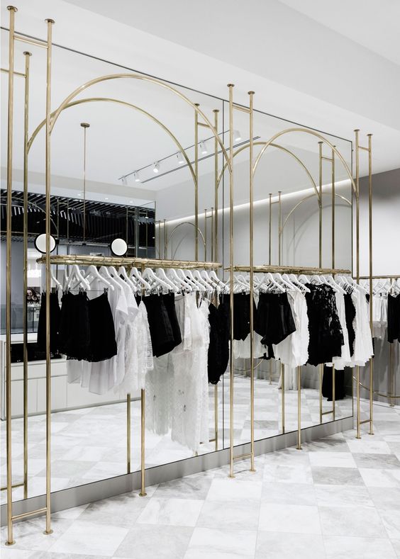
Alice McCALL store in Melbourne (image source: Yellowtrace)
When you own a retail store that’s limited in terms of space, it doesn’t mean you should limit your creativity. To achieve an authentic and timeless fit out design, opt for a minimalist approach to garner a sense of sophistication, and with little effort. Consider some unique and affordable strategies to make a compact store look bigger with ceiling and wall fixtures that create the illusion of height and space. Think complimentary interior palettes like whites, pastels and neutral tones for your wall finishes to reflect more natural light, and install well-placed mirrors to expand the visual space within your shop.
Fast Fitouts CEO Adam Parker weighs in on the fit out techniques that enhance the sense of spaciousness.
“The minimalist approach has many merits, including the fact that it’s less costly, it allows for simplified redecorating or display changes, the products are highlighted, the design is timeless, and more importantly, the customers appreciate its simplicity. High ceilings or no ceilings are the current trend in minimalist retail fit outs.”
Take the shopping experience to new heights
From floor to ceiling fixtures; play around with the available vertical space for your merchandise placement.
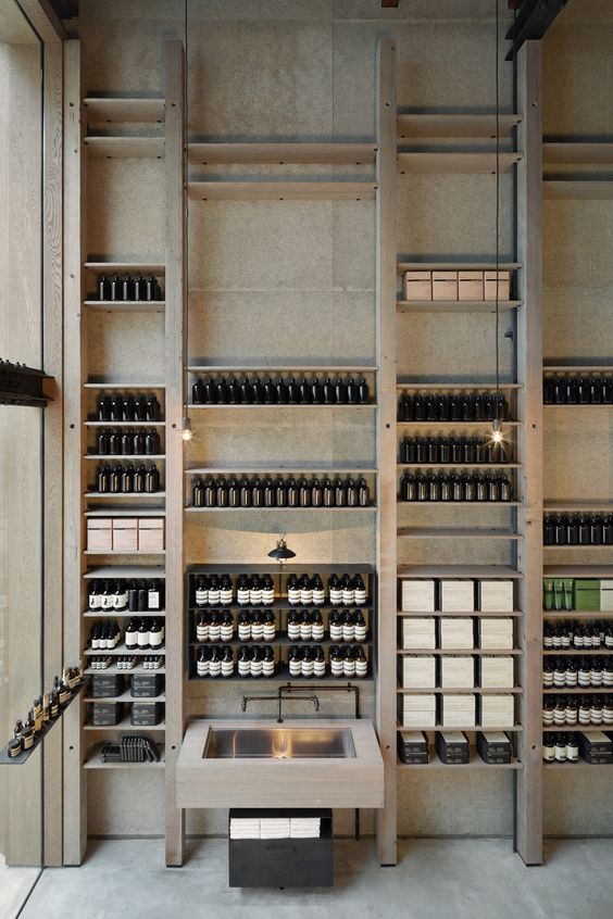
Aesop store in Tokyo (image source: designboom)
One of the biggest challenges facing many retailers is finding adequate shelving and product display solutions to ensure all stock is being showcased to the advantage of both the business and the customer. A carefully considered shop fit out would utilise the available vertical space to attract eye-level attention to its products and promote an ease of traffic. Think custom joinery and shelving solutions to get the most out of your available space.
Hire a an expert shop fitter to create an architectural dreamscape with custom-built cabinets and stand alone counters offering a plumage of products that deserve to take the centre stage – and don’t forget corners or central pillars for nuances like decor and smaller items.
Adam Parker recommends custom joinery like small, modular units to get more bang, and not to mention space, for your buck.
“Not only are these units a cost-effective solution, but they’re also designed for repositioning to recreate space.”
Let the sunshine in
Invite more natural light into your store for a bright and airy feel that will make your space feel even larger.
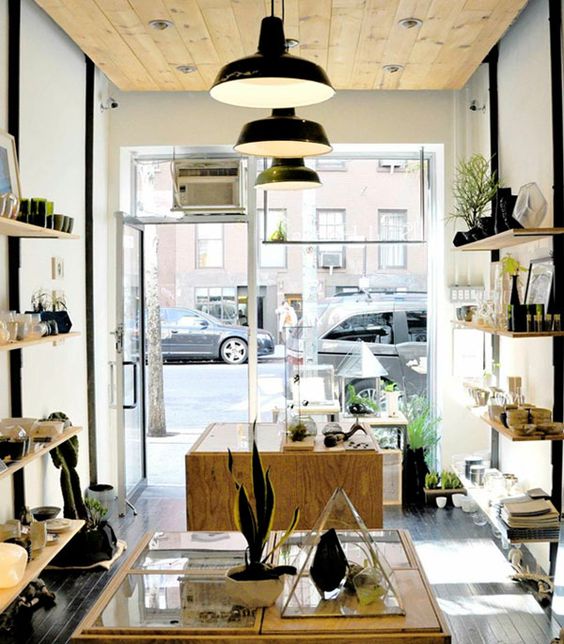
Apartment 34 in New York (image source: interiordesign)
Smaller retailers are embracing the available natural light with large windows and glass shop fronts for a naturally inviting entrance. What better way to harness your green thumb, save on power bills and open up the potential of your small retail space?! By letting the sun’s rays filter through your store, your merchandise will appear fresher and your layout more spacious.
“All retailers should use glass where possible, but if harnessing the light is a challenge, there’s the option to use flat-panel LED lighting to replicate natural light.”
Make the most of your available floor space
Improve the flow of traffic with a straight floor plan that allows customers to navigate your store freely and view your products efficiently.
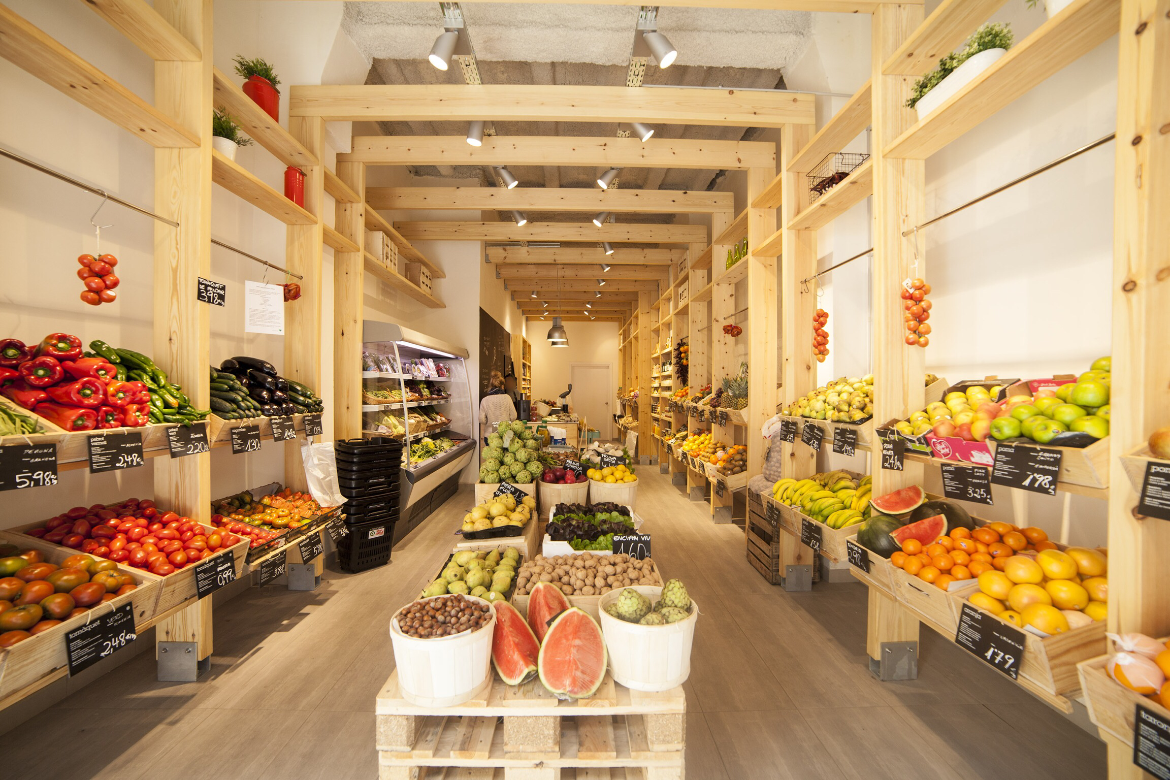
_lamercè store in Barcelona (image source: Fruit shops)
A well-thought out store layout allows a retailer to maximise the sales for each square foot of the given selling space, but that’s all that matters. What owners also need to consider is the kind of floor plan suited to their customer-base. Grocery stores might benefit from showcasing an abundance of items, whereas overcrowding the sales floor might not be the best idea for a clothing or cosmetics store.
“Floor plans are subjective, but the best designs will accommodate the movement of products to maximise sales.”
The best kinds of floor plans find a happy medium between the ultimate customer experience and maximum revenue per square foot. A straight floor plan with cleaner, wider aisles is a great place to start when you envisage how you customers might feel as they browse. For a minimalist approach, opt for a free-flow floor plan to leave your customers with a lasting impression of your store’s sophistication. This option makes use of the walls and fixtures to establish small spaces within your store, which is why it’s one of the most economical and widely implemented store designs. Consider larger custom-built shelves to designate aisles which organise your products in a way that’s easy to navigate.
You can afford to think outside the square when it comes to fitting out your small retail space. By implementing some basic retail design principles, any business owner can fit out a retail or shop space that helps to increase their sales. Get in touch with Adam and the team at Fast Fitouts on 1300 303 831 or email info@fastfitouts.com.au for a free concept design and pricing service
Lets GEt The Ball Rollng!
Enquire NowShare this Post
Related Articles
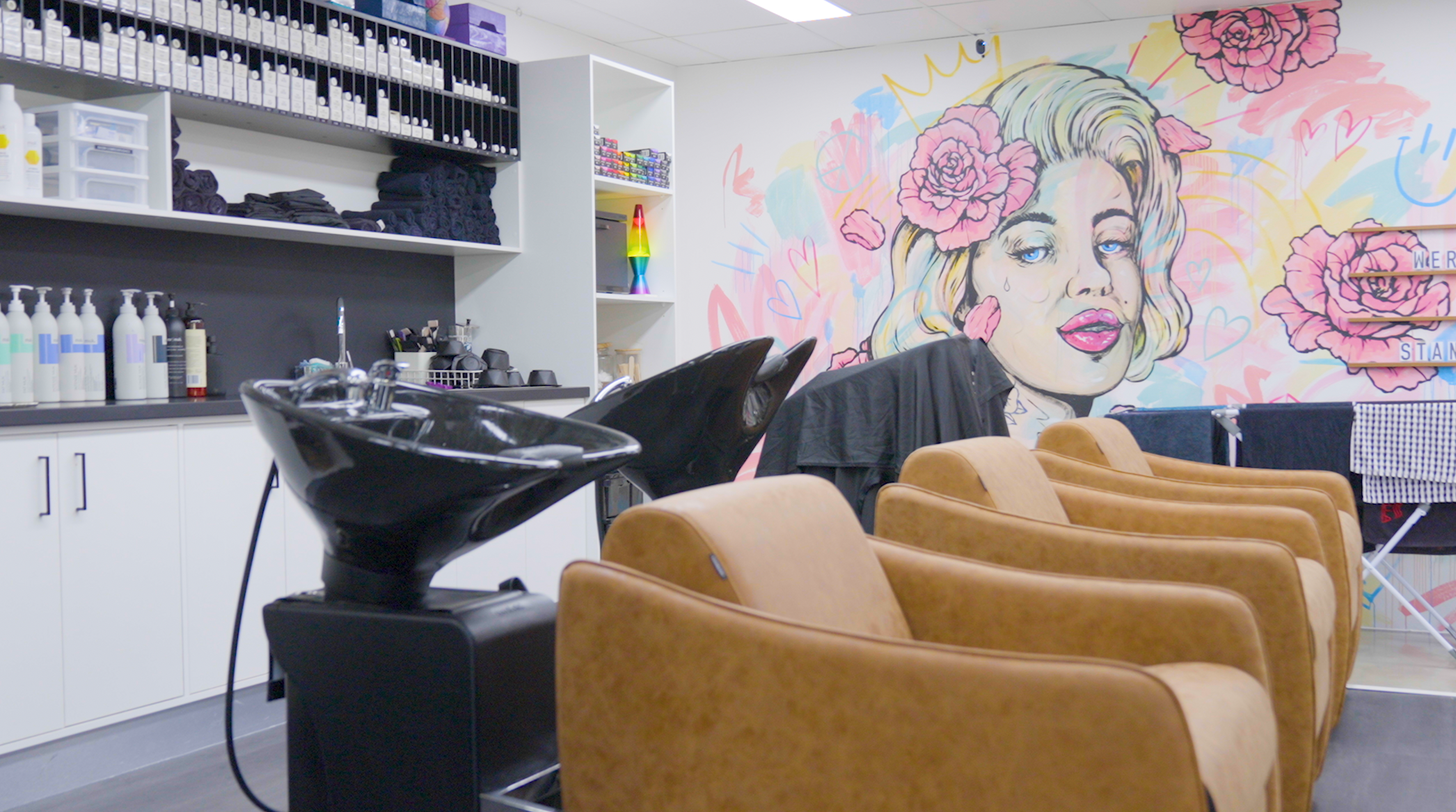
Gold Coast Shop Renovation - Hair Colour Cafe
See how Fast Fitouts helped bring this vibrant Gold Coast salon to life with just a few small renovations and alterations.
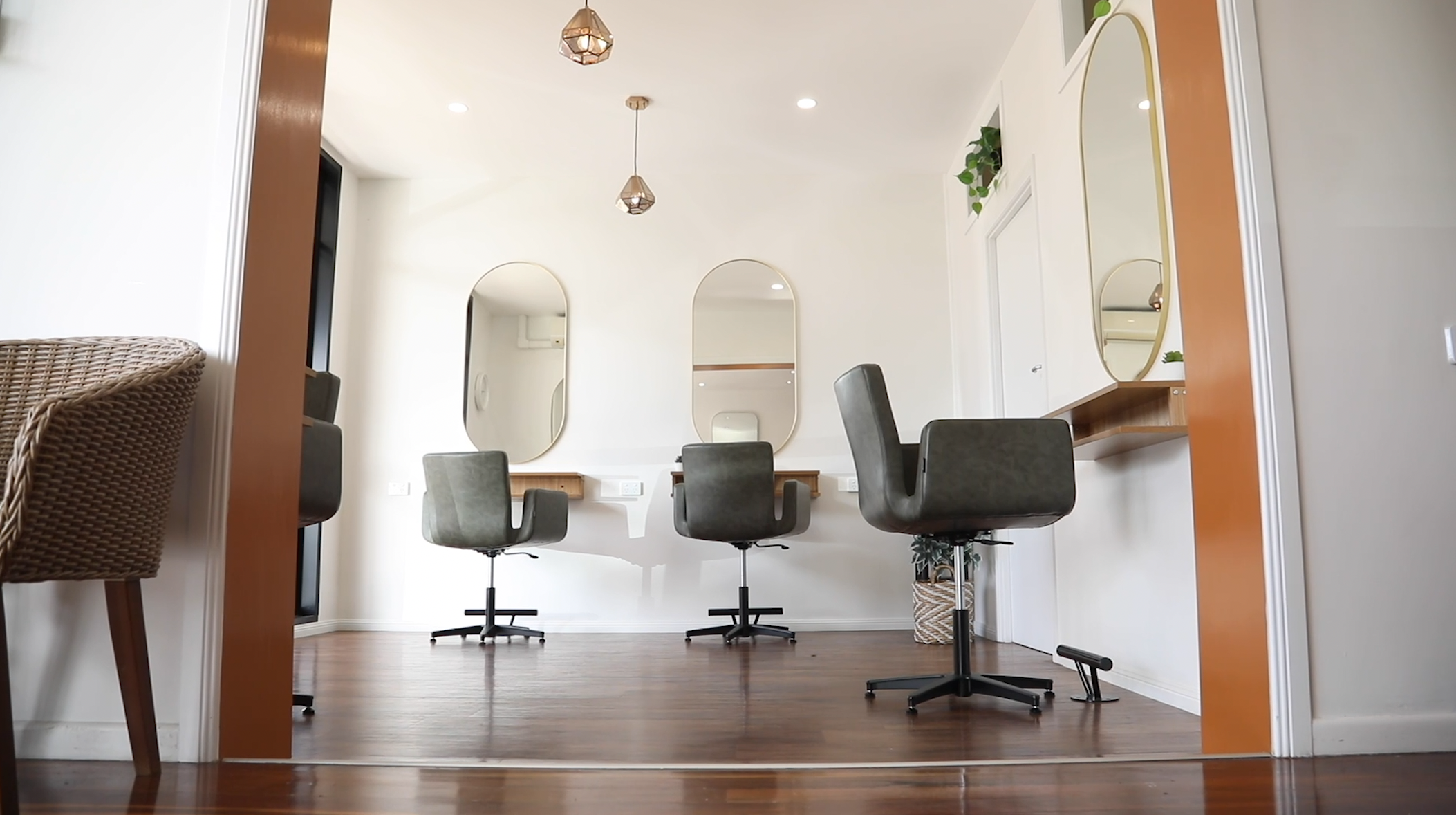
Small Brisbane Shop Renovation - Highlights Hair Studio
We adapt solutions to projects of any size, complexity, and budget, which is exactly why hairdressers Highlights Hair Studio contacted us about upgrading their Aspley salon.
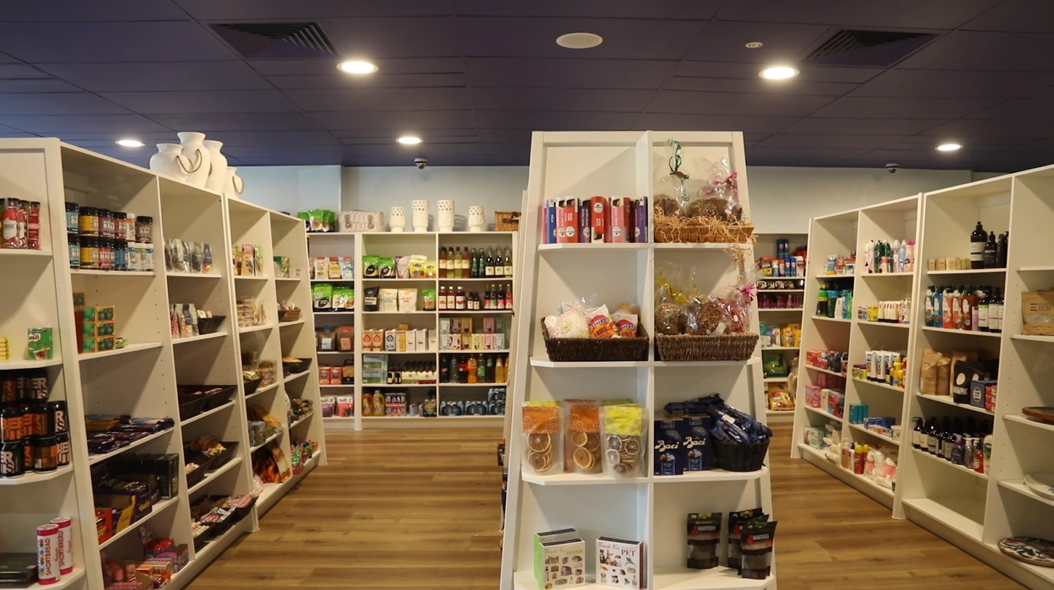
Brisbane Shop Expansion - Rosalie Gourmet Market Case Study
Rosalie Gourmet Market recently had the chance to extend the floorspace of their thriving Paddington boutique. Here's how we helped them do it.
